Hey, Ross here:
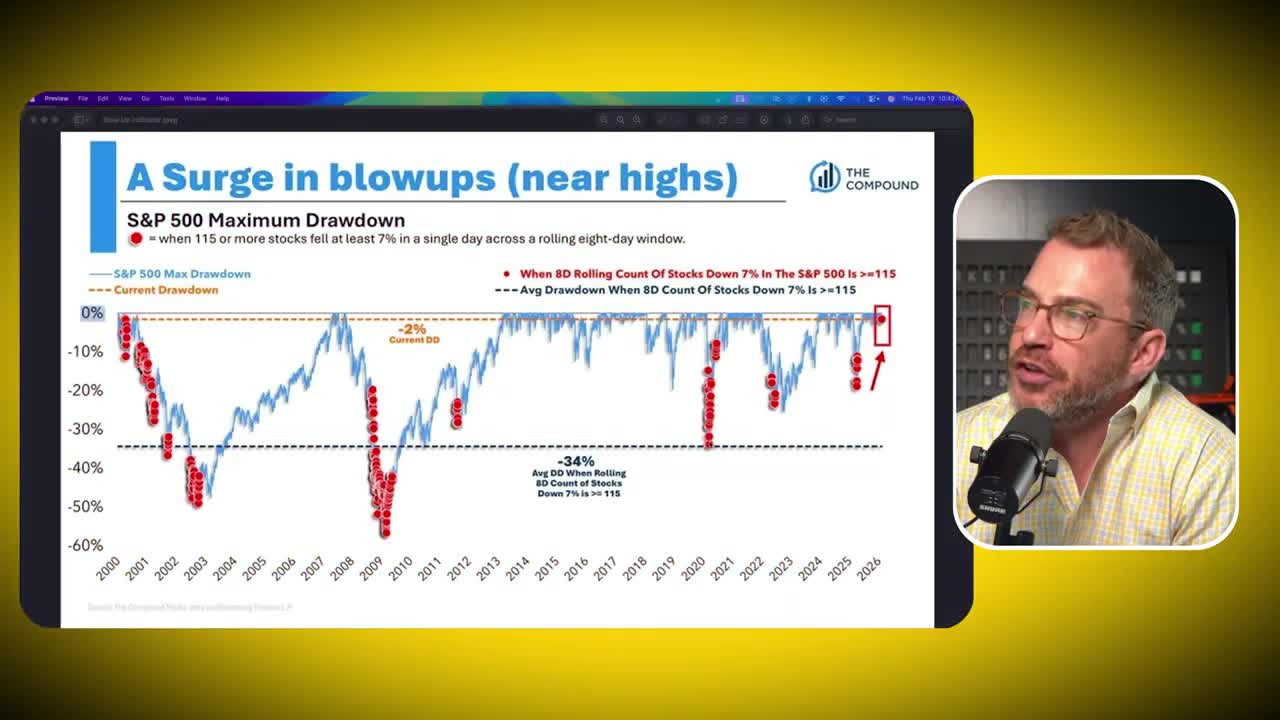
There’s a chart circulating around finance Twitter right now that bears are calling the “Blowup Indicator.” It just triggered what many believe is a major warning for stocks. But I’m not worried, i’m buying instead, because im tracking other stock market crash indicators that are telling a different story.
Here’s the data: In the last eight trading sessions, 115 of the 500 stocks in the S&P 500 index have fallen 7% or more in a single day.
Why does this matter? Because historically, when this happens, the stock market crashes.
Over the last 25 years, the average drawdown following this signal is 34%.
That’s ugly. At first glance, this is serious cause for concern. This specific indicator triggered numerous times during the 2000 Dot-com crash, the 2008 financial crisis, the 2020 COVID crash, and the bear markets of 2022 and 2025.
Today, it’s flashing “sell” again.
So why am I not panicking?
There’s a distinct difference between the signal we’re seeing today and those of the past. It comes down to where the market is currently trading and — more importantly — how things look beneath the surface.
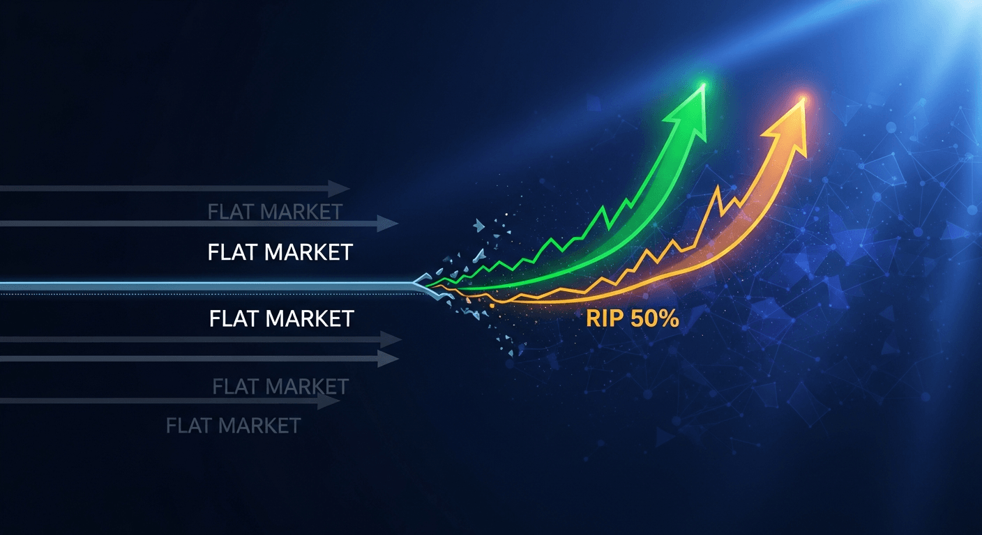
While the consensus view is screaming “crash,” the internal data suggests stocks will soon go higher, not lower.
Here’s why this time is different.
The Indicator vs. Reality
When you see a red dot on a chart that has historically predicted financial ruin, the natural reaction is fear.
This indicator shows that roughly 20-22% of the S&P 500 has taken significant hits recently.
But you have to look at the context.
In previous crashes — 2000, 2008, 2020 — these signals appeared when the entire structure of the market was breaking down. Today, that red dot is printing while the market holds near its highs.
There are signs of a healthy market that would have allowed you to avoid the 2022 bear market and participate in the massive bull markets of other periods.
The key is understanding the difference between the “stock market” and a “market of stocks.”
Market Cap Distortion
Most investors focus on the indexes: the S&P 500, the NASDAQ, the Dow.
The problem is that these indexes are market cap weighted. The bigger the company and the higher the valuation, the more weight it holds.
Consider the current structure of the S&P 500:
- Nvidia is a $4 trillion company representing 8% of the index
- Apple is almost 7%
- Microsoft is almost 7%
The top 10 stocks represent 40% of the overall index.
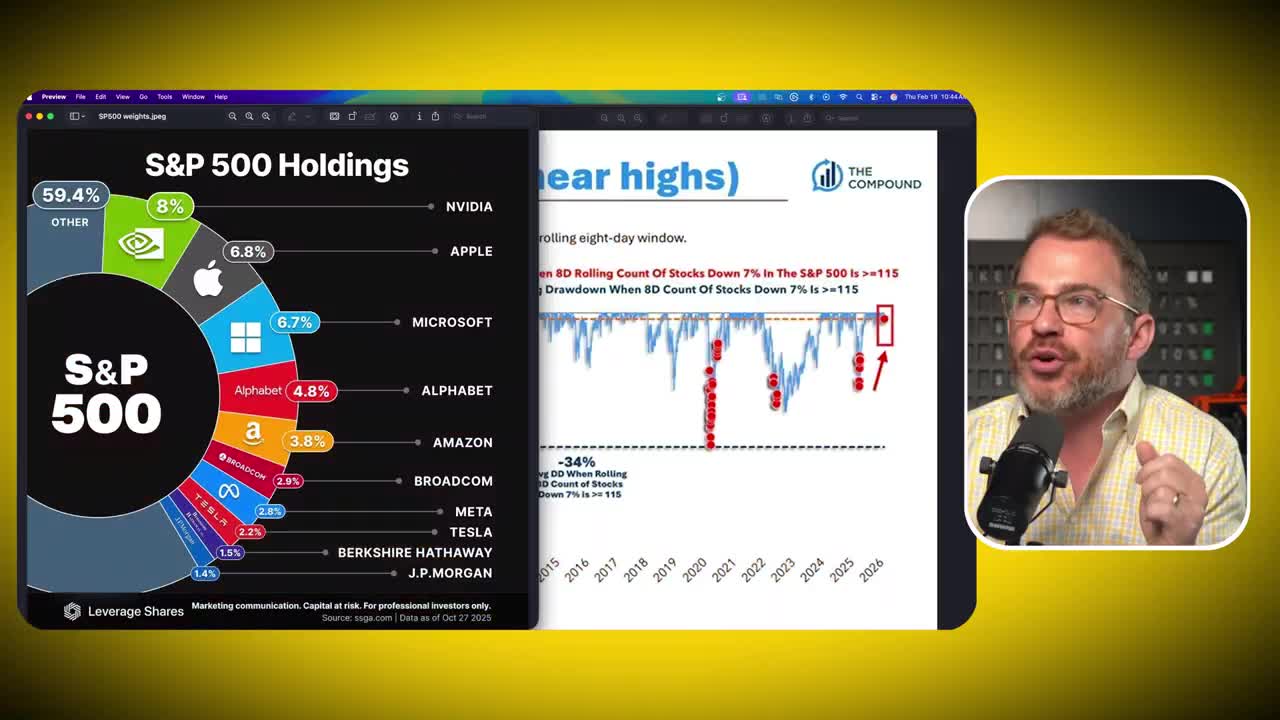
This creates a distortion. If five or six of these massive stocks are doing very well, the index rises — even if two, three, or four hundred other stocks are flat or going down.
Conversely, if the giants stumble, they can drag the index down even if the majority of stocks are healthy.
In bull markets, you want to watch out for signs that participation is not broad — that a small number of names are driving the bus.
Today, that’s simply not the case.
The Truth About Breadth | Stock Market Crash Indicator Number 1
There are specific indicators that strip away the illusion of market cap weighting to show what’s really happening.
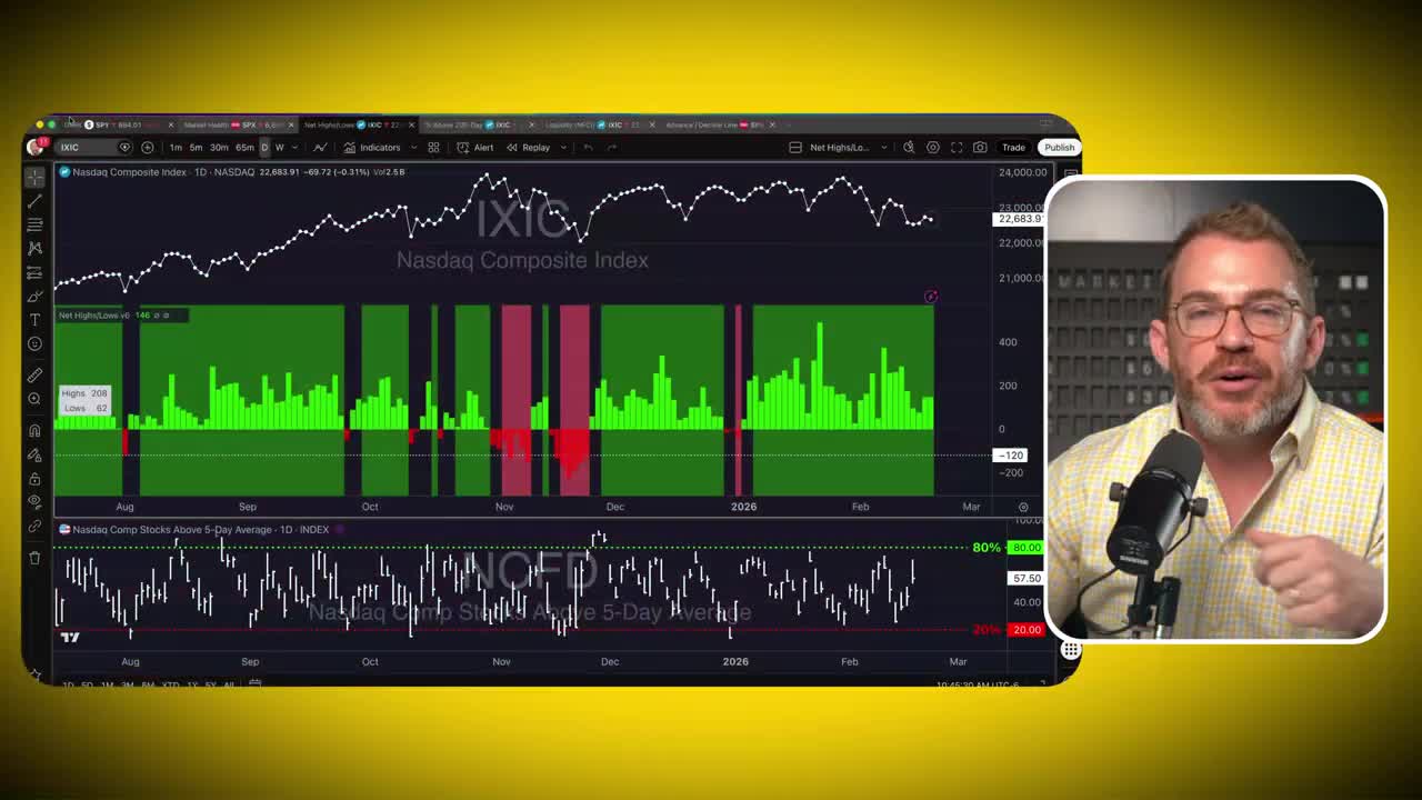
One of the most reliable is the Net New Highs and Lows indicator.
This metric looks at the entire index and asks a simple question: How many stocks made a new 52-week high today, and how many made a new 52-week low?
In a healthy, rising market, you must see more stocks making new yearly highs than lows.
Currently, the NASDAQ Composite index has been going pretty much sideways for a couple of months. But the internal data from a recent session tells a different story:
Compare this to when markets actually break down.
During the tariff situation in March and April of last year, the market rapidly went into a bear market. But early in February — long before the drop — we were already seeing more stocks making new lows than highs.
Just off the highs, that indicator painted red. Seeing that would have gotten you out long before the massive decline.
In a consistent bear market like 2022, you see lots of red.
That’s not where we are today. We continue to see more stocks making highs than lows. This confirms that things are pretty healthy beneath the surface.
Get an entire year of live weekly mentoring sessions, my newsletter, indicators, bonus reports, tons more. Click the link and I’ll see you in the next live session.
The Advance-Decline Divergence | Stock Market Crash Indicator Number 2
Another metric I rely on is the Advance-Decline (A/D) Line.
Similar to the previous indicator, but it simply looks at how many stocks went up versus how many went down. It doesn’t matter if a stock went up 1% or 100%. An “up” is a one; a “down” is a negative one.
Take that net reading and add it to the previous day to create a cumulative line.
When the A/D line is rising, it means more stocks are going up than down. This tells you when markets are healthy and when they’re unhealthy.
The Warning Sign of 2021
To understand why I’m bullish now, you have to look at what a real warning signal looks like.
In late 2021, leading into the 2022 bear market, we saw a massive divergence.
For six months — from July to December 2021 — the S&P 500 index continued to go higher. However, the Advance-Decline line was flat.
How can the market go up when stocks are 50/50 on going up or down?
Because the ones going up were Microsoft, Google, Nvidia, Apple, and Tesla. The big names holding massive weight in the index created the illusion that the market was healthier than it was.
Had you monitored the A/D line, you would have known the rally wasn’t real. You could have gotten out early as it began to break down — roughly 4% or 5% off the highs — and sidestepped the entire market decline.
The Bullish Signal Today
Now look at where we are currently.
The S&P 500 has been chopping around for the last three months, holding up at the highs.
But the Advance-Decline line is pushing higher. We’re seeing progress beneath the surface.
This is happening even though some of the big names are struggling. Microsoft is down. Apple is down. Amazon is down.
Historically, weakness in those mega-caps would have tanked the stock market. But today, even with those massive leaders going down, the market is holding up at its highs.
All the “little guys” are carrying the weight.
The 200-Day Line in the Sand
Institutional investors and technicians treat the 200-day moving average as the line in the sand.
If a stock is above its 200-day moving average, it’s in a long-term uptrend. If it’s below, it’s in a long-term downtrend.
Historically, in healthy bull markets, we see 60% to 70% of stocks staying in that long-term uptrend.
Right now, the percentage of NASDAQ Composite stocks above their 200-day moving average is holding up in that 60% to 70% range, where it’s been the last 12 to 18 months.
It’s not rolling over.
The only cause for concern is if this number drops below 50%. We got close last November, but we pushed back up.
The vast majority of stocks are in long-term uptrends.
Volatility Creates Opportunity
So why are we getting this “Blowup Indicator” warning?
We’re in a very volatile period.
The dollar is losing value. World governments are diversifying outside of U.S. debt. The macro order is changing. Silver went up 40% in a month, and then the miners got slammed down.
There’s a lot of volatility right now.
But the fact that roughly 20% to 22% of the S&P 500 can take 7% intraday hits and instantly recover — while the market holds up near the highs — is a massive sign of strength.
The signal we’re seeing today is like the signals that appeared in 2002, at the bottom in 2009, and at the bottom in 2020.
It’s a signal that the market is recovering despite all of that volatility, despite all those big stocks taking hits. And it’s a sign that the market has massive strength beneath the surface — that breadth is in fact healthy and leading higher.
A Contrarian Buy Signal
While the headline “Blowup Indicator” scares the consensus, the internal metrics — Net New Highs, the Advance-Decline Line, and the percentage of stocks above their 200-day moving average — tell a different story.
I’m taking this as a bullish indicator.
The market is absorbing hits and refusing to break. That alone should tell you something.
Get an entire year of live weekly mentoring sessions, my newsletter, indicators, bonus reports, tons more. Click the link and I’ll see you in the next live session.
DISCLAIMER: Traders Agency does not offer financial advice. The information provided is for educational purposes only and should not be considered financial advice. Traders Agency is not responsible for any financial losses or consequences resulting from the use of the information provided. Trading carries inherent risks and may not be suitable for all individuals. You are advised to conduct your own research and seek personalized advice before making any investment decisions, recognizing the potential risks and rewards involved.
See more from Traders Agency on Google
Make us a preferred source and our market analysis will appear more prominently in your Google Search, Top Stories, and AI results.
Add to Preferred Sources