I often get questions from traders about how my time frame charts work. More specifically, they want to know how to read candlestick charts.
And that’s an important question to ask since our entire trade setup centers around our charts!
But many financial gurus don’t like to give away this information. Luckily for you, I’m not like those other guys!
These aren’t the candlesticks that your grandmother used to decorate her dining room. I’m talking about those red and green lines you see in my time frame charts every day.
They may seem complicated at first, but candlestick charts are easy to understand once you know how they work.
Let’s dive in and talk about candlesticks and ticks!
Price Action
Naked price action is critical information for any trader. It tells you exactly what the price is doing at any given time.
The price action dictates what’s going on in the market. It’s important to remember this.
But how can we visualize and track price action as we prepare to trade? That’s where candlestick charts come into play.
Now let’s explore the details of candlestick charts and how they function…
Types of Candlesticks
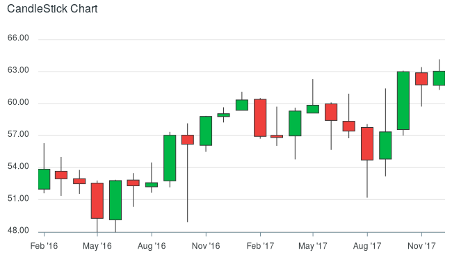
A chart is made up of lots of individual market candlesticks. There are several types of candlesticks, but let’s take a look at bullish and bearish.

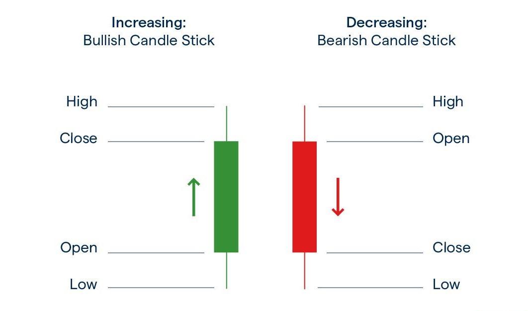
A green candle represents a bullish market. A bullish candle means that the price has increased over a given period.
Green means positive price movement.
A red candle typically signifies a bearish market. This means that the price has decreased over the specified period. The market is down.
Red means negative price movement.
Time Matters
If you’re looking at a 5-minute chart, each fully-formed candle represents 5 minutes of price action. An hourly chart means that each candle represents an hour.
A day chart signals a day’s worth of activity, and so on.
These timeframes play a pivotal role in helping us determine when and how we should enter a market.
You can learn more about short-term and long-term trading in this free article I wrote: How To Interpret Charts.
Traders garner information from these candles. They tell you all you need to know about what’s happening in the market.
The rectangular part of the candle is known as the “real body.” It shows us the specific price action relating to the opening and closing price.
In terms of the bullish candle, the bottom of the body shows the opening price, while the top shows the closing price. Bearish candles are the exact opposite.
The bearish candle’s top is the opening price, while the bottom is the closing price—since the bearish candle is displaying a price decrease.

When looking at charts, you’ll often see candles with vertical lines stretching on both ends. These vertical lines are referred to as the wicks of the candles. The wicks indicate the highest and lowest price of the period.
The price would have touched the very top and the very bottom of the wicks as the candle was forming for closing. This is invaluable information for a trader as it gives us an idea of the overall price range.
These candles represent ticks. These ticks are the overall price movements within a specified timeframe. In futures markets, ticks are how we make money.
Each tick represents a value in a futures contract. The more upward ticks we see in a trade, the more money we make.
Check out my article on tick values to understand how we use them to make profitable trades.
The Bottom Line
Market candlesticks serve as excellent indicators of traders’ emotions.
When traders are feeling confident in a market, we’ll see more bullish candles. If they’re pessimistic about a market, then bearish candles will dominate the chart.
Smart traders rely on candlesticks to make trading decisions since they can help forecast the short-term direction of price actions.
With ample practice, you’ll be able to read patterns in trading charts in no time.
Before I Go…
There are multiple ways to trade the futures, stock and other markets. We can trade the indexes, both up and down, as well as individual stocks…
But I have been working on a special strategy for identifying great stocks that you might want to learn more about.
If you’re interested, check out the important P.S. below…
For more on the markets as well as trading education and trading ideas like this one, look for the next edition of Josh’s Daily Direction in your email inbox each and every trading day.
I’ll be bringing you more of my stock and futures contract trading tutorials as well as some additional trading ideas.
And before you go, head on over to the Traders Agency YouTube channel for breaking market news, live trading sessions, educational videos and much, much more!
Keep on trading,

P.S. I have been working with my team to find what I call “marked stocks.”
These are stocks that are potentially setting up to generate big gains… And you need to get in on them with me.
The post Candlestick Charts Don’t Have To Be Complicated appeared first on Josh Daily Direction.


