Hey, Ross here:
In the days leading to the Fed decision, I’ve been saying we could actually see the market dip a little, even if the Fed cuts rates.
Yesterday’s market action proved me right.
While the Fed did cut rates, Powell framed it as a “risk management cut” – explicitly citing the weakening jobs market as the main driver.
Like I said, don’t be surprised if the market dips – and continues to dip for a while longer.
But here’s what we should really be paying attention to right now.
Chart of the Day
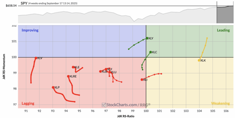
This is what is known as a Relative Rotation Graph.
This graph shows how the various S&P sectors have been moving over the past four weeks.
The “trail” for each sector charts the path these sectors have taken over that time period.
And the direction they’ve been moving tells you whether a sector is getting stronger or weaker compared to the overall S&P 500 index.
Sectors in the top right are strong and still gaining strength, which makes them the market leaders.
Technology was there, but it has just drifted into the weakening zone.
Meanwhile, Consumer Discretionary and Communications have gained momentum and moved into the leading camp.
The bottom right shows sectors that remain strong but are beginning to lose steam, which is where Technology is headed.
The bottom left contains the laggards.
These are the weakest sectors, and most of them – Energy, Real Estate, Financials, Utilities, Staples, and Health Care – are stuck here, still underperforming.
The top left is the improving quadrant, where weak sectors begin to show signs of life, though right now none of the major groups are firmly in that zone.
Why is a chart like this so informative for us traders?
I explain more below.
Insight of the Day
One of the most important thing to know as trader is to know which way the money is flowing.
The market is dynamic not static.
And that means it’s all about movement – about flows.
It’s not about knowing where the money is now – but where the money is flowing to next.
That’s how you position yourself ahead of those flows and use them to your advantage.
Sure, the market may be dipping right now – and may continue to dip.
But there are specific areas of the market right now that the money is flowing away from – and that the money is flowing toward.
We want to position ourselves in the incoming money flows.
The chart I shared with you today is a helpful tool.
But it only tells you where the money is flowing into on a sector level, which is still too broad for us to make targeted moves as traders.
We want to know where the money is flowing into on a stock level…
Which is why tomorrow, Friday Sep 19, at 11 a.m. Eastern…
I’m going LIVE to show you a time-tested strategy for tracking down these money flows…
And following them into stocks that are poised for an explosive move higher.
It’s a strategy that’s led to wins of 51% in 15 days… 77% in three weeks… and even 87% in just 24 hours.
I’ll walk you through it step by step tomorrow…
And even share details of some fresh opportunities the smart money is piling into right now.
So just click here to secure your seat for my live training session…
And I’ll see you Friday morning at 11 a.m. ET.
While everyone is wringing their hands about how and why the market is dipping even after the Fed cut rates…
You could be taking advantage of the torrent of money that is still flowing beneath the surface.
Customer Story of the Day
“I’m happy I recently opted in to the Ross Givens’s Trading Club at Traders Agency (at the best and fairest offer I could possibly get).
I’m new to trading U.S. stocks and options on a regular basis but it doesn’t matter, Ross does all of the hard work for me while I’m trading at my own pace (he knows how to trade successfully most of the time and I know that I won’t win every trade. Fair enough).
He and his great team share a lot of their trading experience in live sessions. Great job. Thanks a lot!”
Ross Givens
Editor, Stock Surge Daily